Colors of the year for 2022
January 5, 2022
With a new year come new ideal color trends in all facets of design. Everything from interior wall colors to book design will more than likely feature one or more of these colors in 2022. Overwhelmingly, the top color is a shade of pale, earthy green, perhaps for its soothing effect and appreciation for nature during what seems like the never-ending pandemic. For whatever reason, the good folks at Architectural Digest tell us that brands like Behr, Sherwin-Williams, and others predict this color will rule the year.
Most of this year’s top colors reflect a broad, back-to-nature trend in interior design. According to paint manufacturers, the biggest color story of the year ahead is a shift from cool to warm undertones. Think cozy creams and light taupes rather than all-white, again trending back to nature.
 Behr’s Breezeway is a silvery green suitable for everything from beachside vibes to modern contemporary. Breezeway is a standout of the 20 shades that make up Behr’s 2022 color trends palette and functions as a perfect neutral for those wanting to brighten a space by bringing the outdoors in.
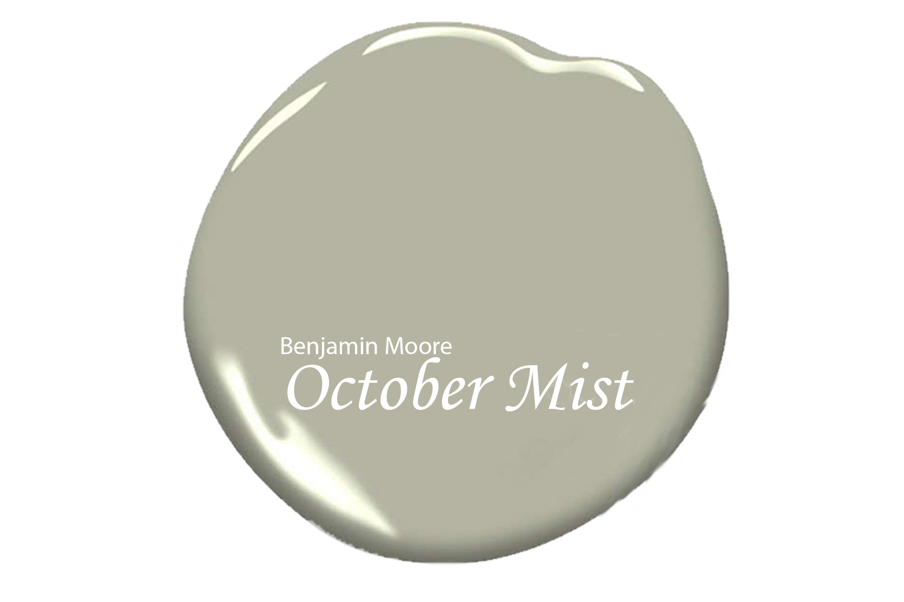 Benjamin Moore’s October Mist is a soothing shade of green offering a connection to nature. Much like a flower stem, this grayish-green shade blends in and lets other dazzling colors pop.
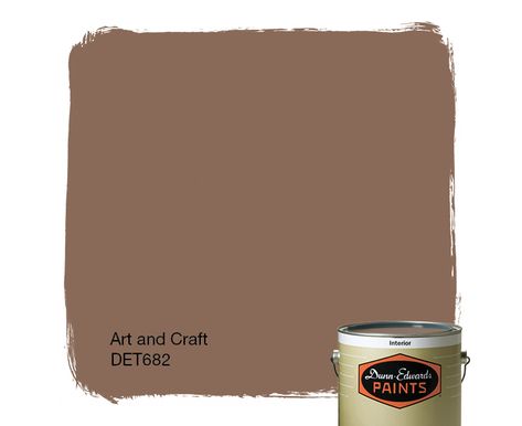 Art and Craft by Dunn-Edwards takes a departure from the abundant pale green trend for 2022 but still stays within the natural palette. Art and Craft is a light and airy take on brown and is a down-to-earth color that brings stability, comfort, and calm.
 PPG’s Olive Sprig is another grayish-green tying in with the idea of renewal and rebirth. This trendy color offers a nice transition from cool grays to neutrals with a little personality.
 Guacamole by Glidden is a more festive and appetizing shade of green for 2022. Perfect for kitchens, Guacamole looks great against a white subway tile backsplash but is also perfectly at home entertaining in the living room.
 Breathe by Graham & Brown draws its inspiration from the sky rather than the earthier greens and browns. A neutral pale, powdery blue, Breathe also lends itself to a feeling of wellness and sustainability.
 Sherwin-Williams’ Evergreen Fog is another grayish-green that takes its name from thick, heavy air. This super-versatile color brings in the aesthetics of the 70s while merging with the spirit of organic modern. Evergreen Fog will play well on walls and cabinets at home while fitting in nicely with commercial spaces.
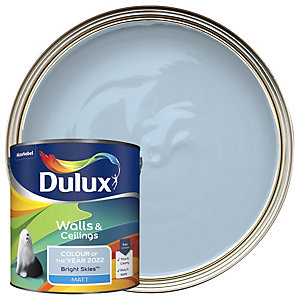 Bright Skies by Dulux -In a year where forecasters are latching on to any idea of brighter days ahead, Bright Skies is an airy, open blue tone that can reinvigorate any room. It’s a fun yet functional option that pushes the boundaries of a neutral.
 Very Peri by Pantone -Last but not least, industry leader Pantone selected a purple-blue shade of periwinkle. If you’re gun-shy about using too much color or taking that first step, it’s a great choice to use on maybe one wall instead of all four. And it’s markedly different from any pale or olive green! Very Peri brings a sense of playfulness to interiors and invites a few unexpected color combinations.
And here are a few more color picks for 2022 from Better Homes and Gardens:
 Better Homes & Gardens’ Laurel Leaf is the first-ever paint color of the year for Better Homes & Gardens. This dusty green mimics the color of eucalyptus leaves and again reflects a desire to bring nature into our homes. Laurel Leaf pairs well with creamy white and beiges to foster a comfortable, relaxing atmosphere.
Instead of naming a single color of the year, Valspar created a palette of 12 nature-inspired colors that satisfy the craving for comfort and calm. These colors of the year include warm neutrals, dusty pastels, and soothing blues and greens, ranging from light and subtle to dramatically dark.
 Aleutian by HGTV Home by Sherwin-Williams. Like a well-worn pair of faded blue jeans, Aleutian embodies comfort and relaxation. This washed-out indigo serves as the foundation for a larger 2022 color collection called Softened Refuge. Soft neutrals with muted earth tones use color to create a sense of comfort and calmness, a recurring theme in this year’s selections.
If you’re looking to refresh or renew your interior, check out some of the colors of the year at your local paint store or talk to your interior designer. (A practical thought: be sure to look at actual paint chips; don’t rely on screenshots of colors to make your final choices. Computer screens don’t always give an accurate picture of color.) Whatever your color path journey, think about the vibe you want from your space … calm, quiet, and relaxing, or something with a little more visual noise. Make your Ideal home ideal with just the right color!
Latest Posts
June 22, 2026
Fourth of July Celebrations Near Your Ideal Home
June 16, 2026
IDEAL Neighborhoods with Splash Pads & Pools
May 20, 2026
Ideal Homes & Neighborhoods App
April 30, 2026
Ask Your New Home Builder: What’s Behind The Walls?
April 29, 2026
Ideal Military Moves
April 29, 2026
Downsizing: Why New Homes Make Sense
April 28, 2026
Spring Showcase: Fresh Pricing & $16K Your Way
April 9, 2026
5 Tips for Using Your HVAC System to Reduce Allergens in Your New Home
March 12, 2026
Should You Add Features Now or Later in Your New Home?
Previous Article