HOME COLOR TRENDS FOR 2021
December 29, 2020
Starting in late summer and early fall when many paint companies began releasing their color trends for the upcoming year, it became apparent that COVID-19 had made an impact on this industry, just as it had on pretty much everything else during 2020. The pandemic seems to have led to an emphasis on providing a feeling of warmth and shelter in our homes. The majority of paint companies appear to have trended toward colors that help create an overall environment where individuals can feel comfortable, truly relax and recharge. If you're thinking about tackling an easy COVID-friendly weekend project, consider these color trends to help create a haven that is soothing and comfortable for the place we're all spending a lot more time in lately. Warm and serene tones have proven very popular. This includes everything from soft pastels to tranquil grays and blues. But the color choices don’t end there. There’s also a trend toward the addition of brighter hues to add color and cheer. So, it’s not unusual to see a warm, soothing environment with an occasional pop of color.
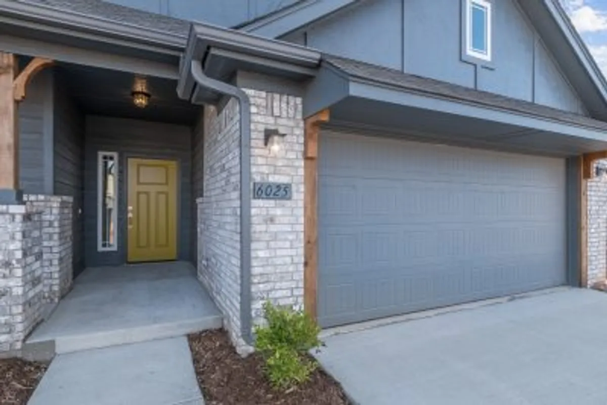
Pantone has fully embraced this dichotomy by choosing not one but two colors of the year for 2021. These include the neutral Ultimate Grey and a cheerful yellow called Illuminating. When used together in the same room, these two colors provide, in addition to warmth and positivity, a sense of strength and practicality. Feelings everyone needs in trying times. These colors are showing off on this new home at 6025 Platinum Dr. in Stillwater. Kelly-Moore Paints' color of the year is Sun God, a beautiful brassy yellow that pairs wonderfully with neutrals or other bold selections. Benjamin Moore’s color of the year is Aegean Teal. A lovely, calming neutral blue, this color is one of 12 hues included in the company’s 2021 palette. Dulux went with three separate palettes for the new year: Reset, Nourish and Retreat. Reset includes bolder tones that have vibrant pops of color reminiscent of the 70s. Nourish tones are calm, neutral and nurturing. The Retreat palette consists of more earth-based hues that lend themselves to diverse environments, just as our homes now tend to include such diverse activities as home offices, gyms and play areas. Sherwin-Williams went with the warm and sophisticated Urbane Bronze for their 2021 color of the year. It’s relaxing and neutral enough to be used as a base and combined with other color tones. Behr, on the other hand, chose a color palette of 21 distinct hues that can all work together despite being divided into 6 color themes. These themes include Subtle Focus, Casual Comfort, Calm Zone, Quiet Haven, Outdoor Escape and Optimistic View. Pittsburgh paint company, PPG, went with three colors of the year for 2021: Misty Aqua, a watercolor cerulean blue; Big Cypress, a shaded ginger with persimmon undertones; and Transcend, a cozy neutral mid-tone oatmeal hue. Whatever color scheme you choose for 2021 and beyond, here’s hoping it provides a treat for your eyes and a balm for your soul. Ideal Homes and Neighborhoods wishes you and your family a happy, safe and healthy new year.
Latest Posts
May 20, 2026
Ideal Homes & Neighborhoods App
April 30, 2026
Ask Your New Home Builder: What’s Behind The Walls?
April 29, 2026
Ideal Military Moves
April 29, 2026
Downsizing: Why New Homes Make Sense
April 28, 2026
Spring Showcase: Fresh Pricing & $16K Your Way
April 9, 2026
5 Tips for Using Your HVAC System to Reduce Allergens in Your New Home
March 12, 2026
Should You Add Features Now or Later in Your New Home?
March 12, 2026
Top New Home Features Homebuyers Are Looking for
March 12, 2026
Affordable Design Features We Love in New Homes
Previous Article
10 Staging Tips to Sell Your Home Fast
Next Article